Compressed 02 from Kim Pimmel on Vimeo.
I love this video. Made with ferrofluids (fluid that reacts to magnetism), a magnet, soap bubbles, and dye this video tells a simple and energetic story. I'll be fucked if I know what the story is, just an abstract tale really. A life/death cycle? A journey of discovery? A chemical rite of passage? The ambiguity is the charm here. That and the soundscape matches perfectly with the frantic energy of theses macro exploring visuals. What's you're take on it?
Showing posts with label Inspiration. Show all posts
Showing posts with label Inspiration. Show all posts
Tuesday, September 13, 2011


Thursday, June 4, 2009
Thursday, May 21, 2009
VACATION!
I'm off to LA for some much needed vacation time. Gonna hang out w/ my brother and his finace', meet my new nephew, attend a dubstep/dnb event or two and grab some surf. Looking forward to it. Total Science @ Respect. The Gaslamp Killer @ Dubtroit. Ez...
Thursday, April 30, 2009

Tuesday, April 28, 2009
BIG UP #3 magazine review

Ok well I've sat and digested this mag for over a week or so, and I've concluded that it rad as hell. It definitely gets my seal of approval. In fact if you like art and dubstep in any way, shape or form, you should just stop reading this and go to their site right now and buy it. Make sure you tell them to mark Fragile and Please Do Not Bend on the package as my mix CD came in three pieces (they were cool enough to send me an mp3 version tho). Then again maybe your post office isn't run by rude boy hoods like mine is. All kidding aside, Big UP features dubstep heavy weights such as Emalkay, Goth Trad, Mary Anne Hobbs, SMOG crew, and mix CD by big bad KUTZ. There's also an interesting interview with electronica virtuoso , Amon Tobin. Art by Loic Sattle, Nik Ainley, Gary Fernandez and Blaine Fontanna. So topically, it's pretty spot on. I mean you don't get much better selection that that in my opinion. However the real reason I'm feeling this mag, is that in nearly every interview, they are able to dig in and find the story, and unearth a bit of truth. Its one thing to have a bunch of heavy hitters in the dub and art world and ask a bunch of generic questions and it's another to actually deliver interview that reveals some insight. I mean I usually don't read much about dubstep, I listen to it.
My one criticism would be the layout and the typography (the leading is too much and makes it hard to read). But I've been told this is changing next issue. So yeah not all of it is brilliant, but it's good enough that you feel like you get your money's worth. What's more important is that it's a stateside printed magazine that shows love to underground music and art in genuine way. That's something I need. And in a way, it helps validate the stateside dubstep scene and culture. Even if the name is a little bit 2003 (zing!). You can preview some articles on http://thebigupmagazine.com order the magazine and even download some wicked podcasts there. BTW the Kutz mix was dope and leaned toward the heavy techno-dubstep side.
Friday, March 20, 2009
Revenge of The Fallen
WHoa! big SOund design on this trailer. I admit the first movie was a bit wonk in spots, but I did enjoy the battle scenes, even if they were cut way too fast. This one looks sick as hell tho...
Thursday, February 5, 2009
Waste Baby Lie Face

Most of my inspiration/ jokes image finds are going straight to Waste Baby Lie Face. There's like 16 of us on there now and it's complete mayhem. An orgy of fugly, weirdness, art, and sleaze. So if u need a good laugh, or want to get fired, check out our blog.
Friday, May 30, 2008
LA - Trip
Going to LA to visit my bro Jun 17-23rd. Going to see Benga & Rusko there. And Twisted and Evol at Respect. Anyone wants to link up for tiki drinks drop me a line jerrycrash@gmail.com
Monday, March 31, 2008
James Jean - serious

I've seen this guys work from the Prada animation movie the debuted a month or so ago and I thought it was really tight, but I kinda just skimmed his work, ya know. Got bored today and delved a little deeper, guy's a serious talent. Flowing lines, esquiste taste in color, and fantasical themes. Reminds me of his cover work for Fables at times, blending fairytale fantasy and horror/sci-fi. Clockwork Orange vs. Grim's. Have a look at James Jean.
Friday, February 22, 2008
Justin Lee Williams - Custom Kicks

This dude does some sick ink and pencil drawings... loving the custom kicks he did. Kinda outsider art-esque with hand drawn blocky typography. Some stark imagery for sure. Check out his blog for more work.
Saturday, February 16, 2008
Vanishing Point 2009!

Dodge Challenger 2009
Originally uploaded by jcrash75
2009 Dodge Challenger is sick. They took the best bits of the 1970 Challenger and beefed it up, filled with 2009 muscle goodness, sprayed it Dukes-of-Hazard orange and threw down some racing stripes, Mopar is finally back! To quote Automotive.com : "The Challenger sits on Chrysler's LX platform, best known as the basis of the 300C, and it is fitted with a 6.1-liter Hemi engine, which delivers 425 hp at 6200 rpm and 420 lb-ft of torque at 4800 rpm. The Hemi badge is worth its weight in gold." I'm so getting this car!
The Return of American Muscle

Camaro 2009
Originally uploaded by jcrash75
The Camaro concept car from Chevy was a nice surprise at the auto show. There's some throwback design lines similar to the vintage style that made the Camaro a hot ride in the late sixties and early seventies. I especially like the fact they are emphasizing the wheel well again. My favorite Camaro , the '68, had a nice wide wheel well, and just really looked like a pure America Muscle car. It sat on the road and just dominated. So I'm taken by the new Camaro, and would definitely consider purchasing when/if they come out. Between this and the Dodge Challenger, I'm excited from American Muscle making a comeback. Sick!
Thursday, February 14, 2008
Indiana Jones and The Kingdom of Trapcode Shine
Best use of Trapcode's Shine I've seen used in a long time. Seriously though, this could be a fun movie.
Kai Isselhorst - Facing What Consumes You
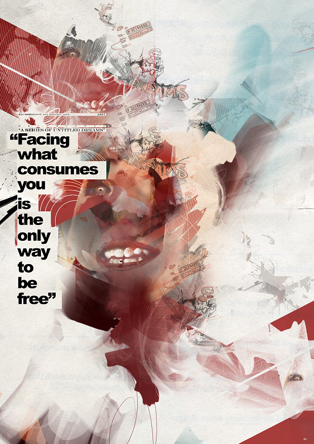
Kai's illustration/design looks about a year or two dated, but still executed really well. Deconstruction mixed with bold typography and some late 80's abstract paintings (the kind you'd find hanging at a local McDonald's/ Hotel). I like it. This particular piece caught my eye because the message sort of hits home. Facing What Consume You is The Only Way To be Free. Whatever you are in to, just dive right in, ya know? Not too get too deep or anything but I think everyone can kind of interpret that to find their own direction. Thanks to NetDiver for scraping this guy up. Check more of Kai Isselhorst.
Wednesday, February 13, 2008
Kinsey's in the new Juxtapoz

Check it out. On the newstands now. Issue #85 Feb 2008. Kinsey's a rad artist that sort of does this half-finished style leaves plenty of construction elements and half rendered figures with a limited black, red, dirty yellow and white color palette. Feels like a mash-up of printmaking, graffiti and figure studies. The one featured above is called Unintended Consequences 60x78 mixed media on canvas.
Not feeling his street art so much, but his paintings are hot. http://www.kinseyvisual.com
Tuesday, February 12, 2008
Mono Myth - Wicked Illustrations

Subscribe to:
Posts (Atom)